Operations
Use the Operations page for detailed energy analysis – year selection, key figures, consumption and views (ET, Duration, Heatmap).
What is Operations?
Operations gives you deeper insights into energy use – either for a building or a single metering point.
Here you can select a year, view key figures, and analyze data across three views:
- ET curve – energy vs. temperature
- Duration curve – load sorted from peak to base
- Heatmap – daily and weekly patterns
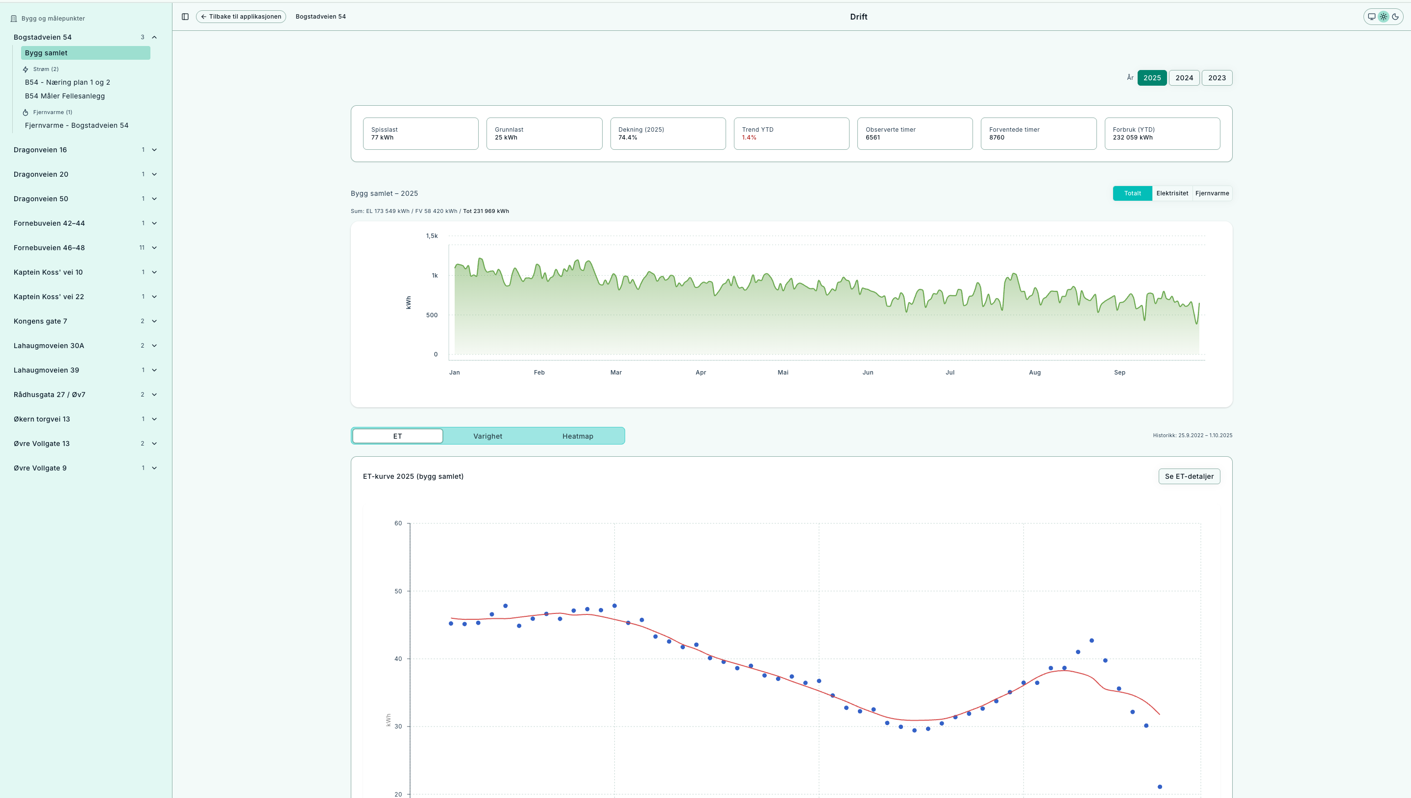
Overview: key figures, annual series, and tabs for further analysis.
How to use Operations
- Select context – from a building (aggregated) or a single metering point.
- Select year – only years with data are shown. Selection is saved in the URL (
?year=YYYY) and can be shared. - Read the key figures – peak, baseload, night share, coverage, total kWh.
- View consumption – annual series for buildings, or a meter-specific dashboard.
- Switch view – analyze via ET, Duration, or Heatmap.
Tip: Use “See details” on each card for dedicated views. Data history (first/last date) is shown at the top.
Key terms
- Baseload – lowest stable level (often night/weekend).
- Peak – highest point, important for dimensioning.
- Weeknight share – how much energy is used at night on weekdays.
- Coverage – percentage of hours with data.
- Total kWh – daily sum (electricity + district heating) for the selected year.
Resolution: all data shown in Norwegian time (Europe/Oslo), including daylight savings handling.
Views and interpretation
ET curve (Energy vs. Temperature)
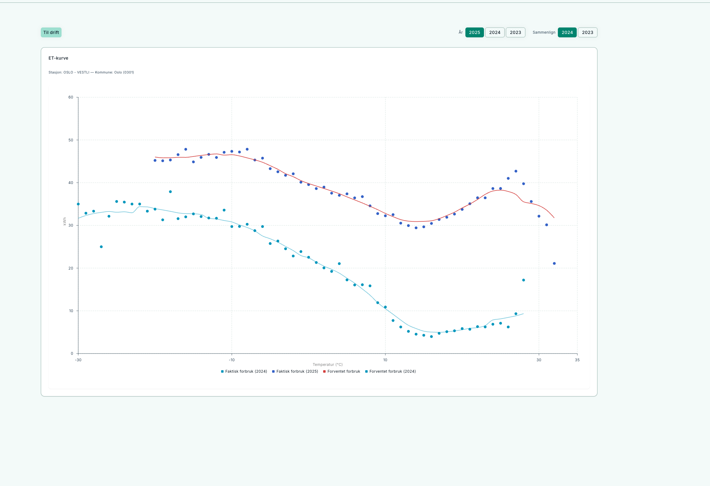
Shows how much of the consumption is driven by temperature.
- X-axis: outdoor temperature, Y-axis: energy use.
- Rising curve = heating load.
- Flat level = baseload/process load.
- Check change point, spread at equal temperatures, and high use at warm periods.
Duration curve
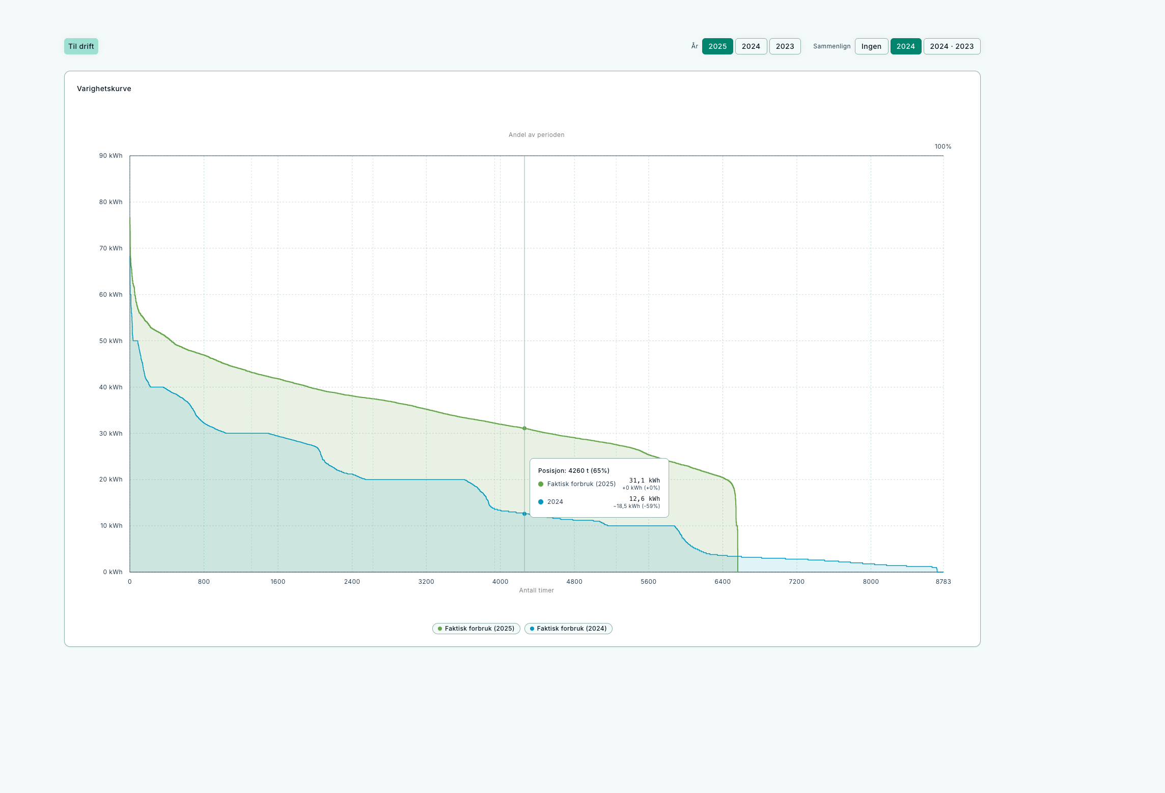
Highlights peaks and baseload throughout the year.
- Left = peaks, right = baseload.
- Thick “tail” on the right → high baseload.
- Compare year to year to measure effect of actions.
Heatmap
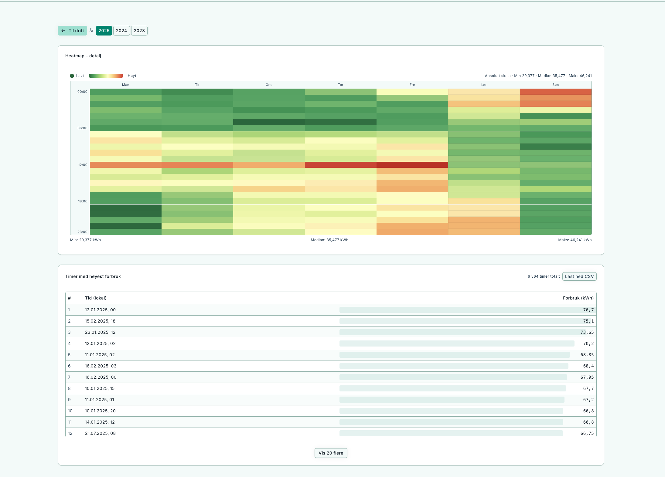
Reveals daily and weekly patterns – useful for night/weekend analysis.
- X-axis: days of the year, Y-axis: hours of the day.
- Strong night bands = unnecessary night operation.
- Weekends should be lower than weekdays.
- Seasonal changes should be visible in heating demand.
Building vs. metering point
- Building – aggregated sum (electricity + district heating).
- Metering point – detailed analysis for one meter.
- History limits are shown at the top right.
Workflows
Reduce baseload
- Check Heatmap for night/weekend patterns.
- Review the Duration curve (right side).
- Adjust operating hours and BMS settings.
- Follow up – baseload should fall.
Identify peaks
- Find peaks in the Duration curve.
- Use Heatmap for date/time.
- Investigate concurrent loads in operations.
Verify savings
- Compare “before” and “after” years.
- Check Duration (lower baseload).
- Check ET (reduced use at high temperatures).
- Ensure coverage has not dropped.
FAQ
-
Why is a year missing in the selector?
Years without data are hidden. -
Why does total kWh differ from other pages?
Operations sums daily electricity + district heating for the year for consistency. -
Can I analyze district heating separately?
Yes, select energy type when opening Operations, or use dedicated views.